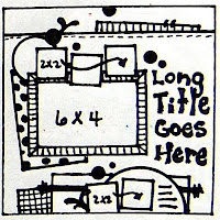
here is a layout of the girls' first trip to the library. i used a sketch from Nuts About Sketches, i did modify the sketch just a bit. i changed the largest image from a horizontal image to a vertical and instead of having all the smaller images square, i made them whatever shape they needed to be to fit the image. I added a white border to all the images, i really like the look of this, it also helps to define each from the others when you overlap them. I added the date at the bottom in a rather bold way, normally i just put the month & year somewhere inconspicuous, but i thought it needed something a more at the bottom. im not very good at titles, im trying to work on that. i love how mercytiara (also check her out on youtube) does her titles! since thats not my strong area i look to quotes for titles. this one is from Jackie Kennedy, but i will also use movie quotes or song lyrics. at the bottom there was space to add a subtitle but since my image was horizontal i didnt have the space, so i added it under


No comments:
Post a Comment